Advanced data visualization
Yellowfin 7.3 encompasses a number of extra enhancements and additions to Yellowfin’s charting capabilities, allowing data analysts to create more insightful visualizations. Answer complex business questions faster – by building more sophisticated, insightful charts in less time – with a range of new advanced charting features.
Set Analysis
Yellowfin 7.3 makes it fast and easy to perform comparative analysis, within the Chart Builder, without the need for deep technical skills and Sub Queries. Quickly create comparative visualizations in a few simple steps using Yellowfin’s Set Analysis function.

Easily define and compare a subset of data values within a selected data set using intuitive point- and-click navigation: Filter a metric by one or more fields (dimensions) on a chart, independently of the report as a whole.
Conducting this type of comparative analysis at the chart level empowers data analysts to answer complex business questions faster, without having to use time-consuming and complex Sub Queries.
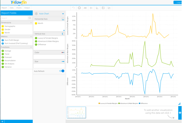
Report Fields Panel: Set Analysis appears as a new function, available within the Functions section of the Report Fields Panel on the left hand side of the Chart Builder.
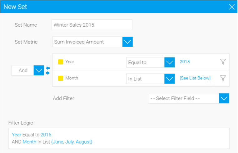
New Set Pop-up: Selecting the Set Analysis function activates the New Set Pop-up window. Drop-down filters allow you to set the metric you wish to filter, choose the fields by which you want to filter that metric, define the value of those fields, and then name the new set you have created. The filter logic selected is displayed in easy-to-understand business terms in a text box at the bottom of the New Set Pop-up. Clicking ‘submit’ automatically conducts the type of Set Analysis designed, instantly visualizing a new comparative chart.

