The 7.3 Set Analysis feature allows you to sub-divide your data at chart level. In addition to filtering your entire dataset from the data tab, you can now further divide this data for comparative analysis in charting.
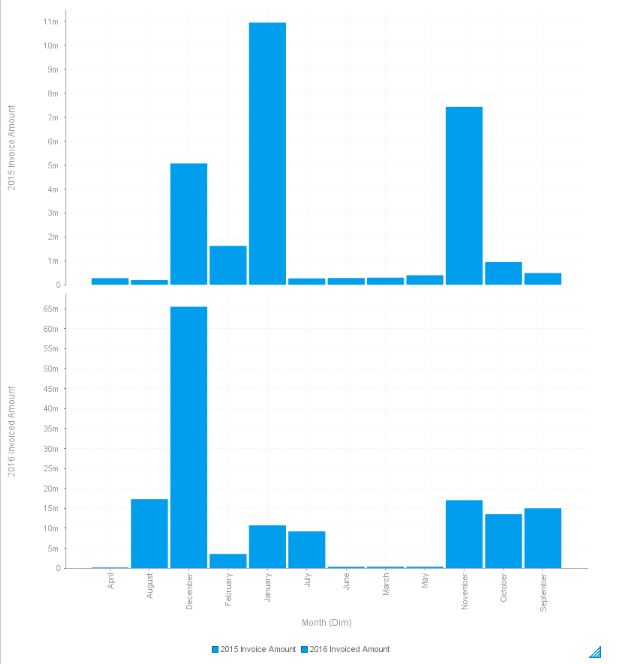
In the example below I am comparing invoice amounts by month between the 2015 and 2016 years.
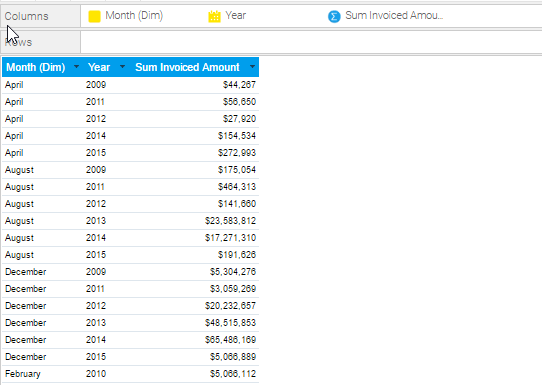
As you can see from the "data" tab, I have included a year, invoice amount. and month field.

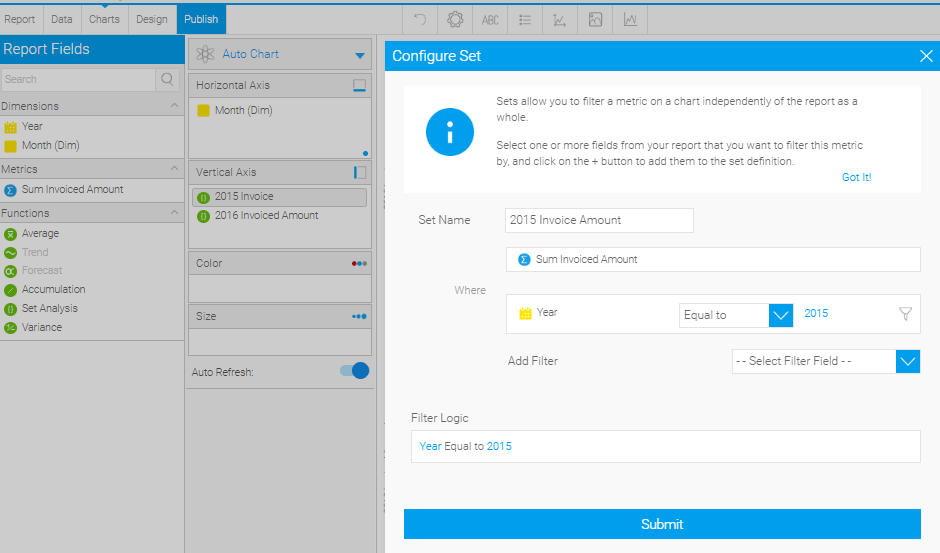
Since I am trying to compare 2015 to 2016, I will create two set analysis fields in the chart builder to represent each year's invoice amount. In the screenshot below, I have created my "2015 Invoice Amount set", by selecting "Sum Invoiced Amount" as my Metric and "Year" as my Filter. As this field will represent my 2015 year, I have set this filter logic to be "Year = 2015".

I then repeated this process for the 2016 year. The final result is two fields to represent this invoice amount over each time period. By placing month on my Horizontal axis, I can create the chart of my choice and compare these two data fields against each other!

