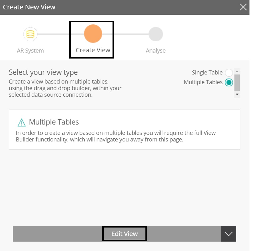
View Creation Screen Button Label
Completed
Hi Team,
There is a minor change needed in Yellowfin 73 view designer,
When we create a new view with single table then label for button will come as Create Analysis, but if we chose Multiple Tables then label will change as Edit View which is confusing for end user and a usability issue.

Please do the needful.
Thanks,
Abhijeet

 I like this idea
Hello Abhijeet,
Thanks for reaching out with this Idea. I've logged this for review and will keep you updated with further information related to this.
Thanks,
Ryan
Hello Abhijeet,
Thanks for reaching out with this Idea. I've logged this for review and will keep you updated with further information related to this.
Thanks,
Ryan
Abhijeet,
Dev is looking at this issue but they wanted to see if you might have a suggestion on what you would like the functionality to be? Right now, when you select one table the system is looking at the user to then Create Analysts on the one table. When you have multiple tables the concept is that you have to manipulate the views to get to the analyst. Understanding this logic, does this help with the system workflow?
What do you think?
Thanks,
Lee
Hi Lee,
We are pretty much aware about the difference between Single table and multiple table views design, we already discussed this with internal team but as per UX Engineers Edit operation is only applicable for the objects which are already created and present in the system, In this case it just navigates to view builder which is clean slate, and it is as good as crating something new.
So Crate View would the appropriate label for this Button.
Thanks,
Abhijeet
Hi Abhijeet,
Thanks for the reply. I've included this on the relevant task. I'll keep you posted as I have more information, or if we have other questions.
Thanks,
Ryan
Hi Abhijeet,
Thanks for the reply. I've included this on the relevant task. I'll keep you posted as I have more information, or if we have other questions.
Thanks,
Ryan
Hi Abhijeet,
I wanted to update this Idea to reflect that this has now been implemented.
Thanks,
Ryan
Hi Abhijeet,
I wanted to update this Idea to reflect that this has now been implemented.
Thanks,
Ryan
Replies have been locked on this page!