Options to alter the Schedule Management Width
Idea Logged
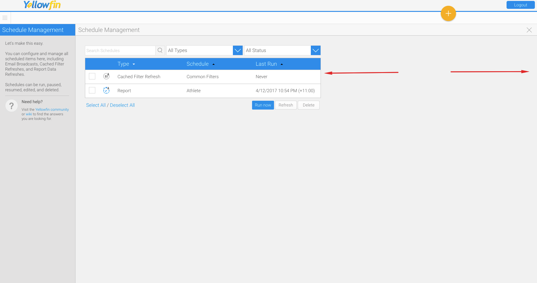
As it stands the list in the schedule management seems to be a fixed size. If you have schedules with longer names you need to scroll horizontally to see either the status or the complete time. When trying to work with many schedules etc. it becomes quite cumbersome.
Please consider an option to either use the whole width of the screen or give some option to set the width of the whole list or of the single columns in order to adjust the list to the content and prevent horizontal scrolling.
Enclosed is a Screenshot of what we see on the screen…lots of unused space to the right and incomplete information in the list.


 I like this idea
Hi Ingo,
This idea has been logged now.
If there is an update, this ticket will be updated.
Let me know if you have any questions.
Regards,
Mahesh
Hi Ingo,
This idea has been logged now.
If there is an update, this ticket will be updated.
Let me know if you have any questions.
Regards,
Mahesh
Replies have been locked on this page!