Needs values inside all charts
Answered
Dear Yellowfin Team,
For some reports values are displaying inside the charts, for some charts not. please provide the option to show the values inside all charts and also provide the option to show the values inside the Pie and Donut charts.
Thanks in Advance,
Karthik K
Files:
Sample.png

 The same question
Hi Karthik,
To follow on from Mark here, I wanted to offer a suggestion to use multi-charts. You can get the chart you were after quite easily.
E.g using the ski team DB.
I'm counting number of athletes vs region.
I build my first pie chart
I then build my 2nd chart, which is going to be used as the label
Now on the report designer, I just put the label inside the pie.
So the multi-chart can give you lots of options, but to even take a step further, you could also create any chart you want if you coded it with javascript charts in 7.3+
Hopefully this gives you the results you were after right now. If this does not please let me know.
Regards,
David
Hi Karthik,
To follow on from Mark here, I wanted to offer a suggestion to use multi-charts. You can get the chart you were after quite easily.
E.g using the ski team DB.
I'm counting number of athletes vs region.
I build my first pie chart
I then build my 2nd chart, which is going to be used as the label
Now on the report designer, I just put the label inside the pie.
So the multi-chart can give you lots of options, but to even take a step further, you could also create any chart you want if you coded it with javascript charts in 7.3+
Hopefully this gives you the results you were after right now. If this does not please let me know.
Regards,
David
Hi Karthik,
I hope all is well,
This feature is known as "Chart Labels" and unfortunately this option is only available to certain Charts, see below:
Horizontal Bar
3D Horizontal Bar
Stacked Horizontal Bar
Cylinder
3D Stacked Column
GIS Map (any)
Pie (any)
Funnel
Radar
Waterfall
With this we have discussed this before within the Yellowfin Community and we can find this with the below links:
http://community.yellowfin.bi/topic/how-can-i-add-labels-to-other-charts-than-the-pie-chart-e-g-column-charts
http://community.yellowfin.bi/topic/labels-on-line-chart
I also want you to be aware that this has been raised with our Devs and we are currently awaiting an update on this.
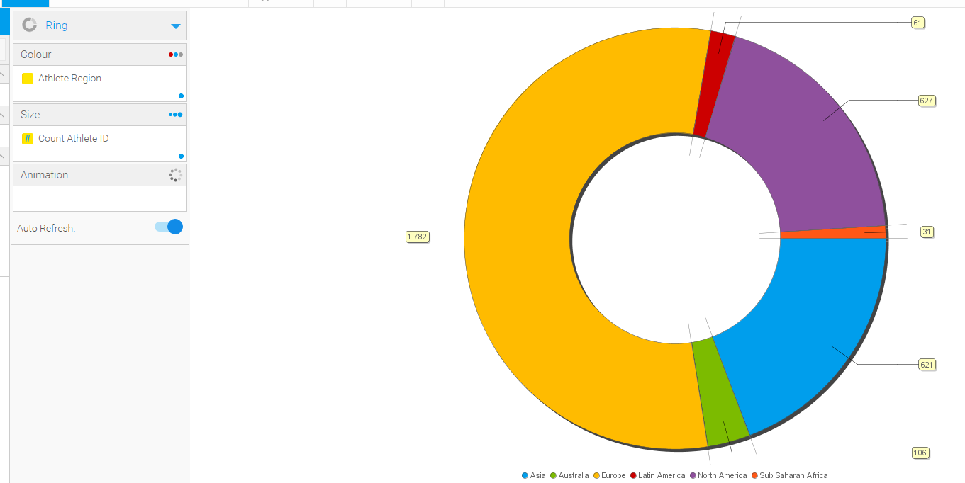
With regards to having this within the Pie and Donut (Ring) Charts, we do have this feature although we can't have these embedded like we can within our Bar Charts. The reason for this is because the Pie and Ring Charts tend to have limited spacing between each data result there for we can't add a Label to fit between these. See the below example;
As you can see it would be hard to add a Label between each data result hence why we have these Chart Labels coming out. I hope this helps.
Regards,
Mark
Hi Karthik,
To follow on from Mark here, I wanted to offer a suggestion to use multi-charts. You can get the chart you were after quite easily.
E.g using the ski team DB.
I'm counting number of athletes vs region.
I build my first pie chart
I then build my 2nd chart, which is going to be used as the label
Now on the report designer, I just put the label inside the pie.
So the multi-chart can give you lots of options, but to even take a step further, you could also create any chart you want if you coded it with javascript charts in 7.3+
Hopefully this gives you the results you were after right now. If this does not please let me know.
Regards,
David
Hi Karthik,
To follow on from Mark here, I wanted to offer a suggestion to use multi-charts. You can get the chart you were after quite easily.
E.g using the ski team DB.
I'm counting number of athletes vs region.
I build my first pie chart
I then build my 2nd chart, which is going to be used as the label
Now on the report designer, I just put the label inside the pie.
So the multi-chart can give you lots of options, but to even take a step further, you could also create any chart you want if you coded it with javascript charts in 7.3+
Hopefully this gives you the results you were after right now. If this does not please let me know.
Regards,
David
Hi Karthik,
Just checking in to see if the provided solutions has resolved this?
Thanks,
David
Hi Karthik,
Just checking in to see if the provided solutions has resolved this?
Thanks,
David
Replies have been locked on this page!