
Category
Report Builder
Product Version
7.3
How can I include a color dimension in an overlay chart?
Answered
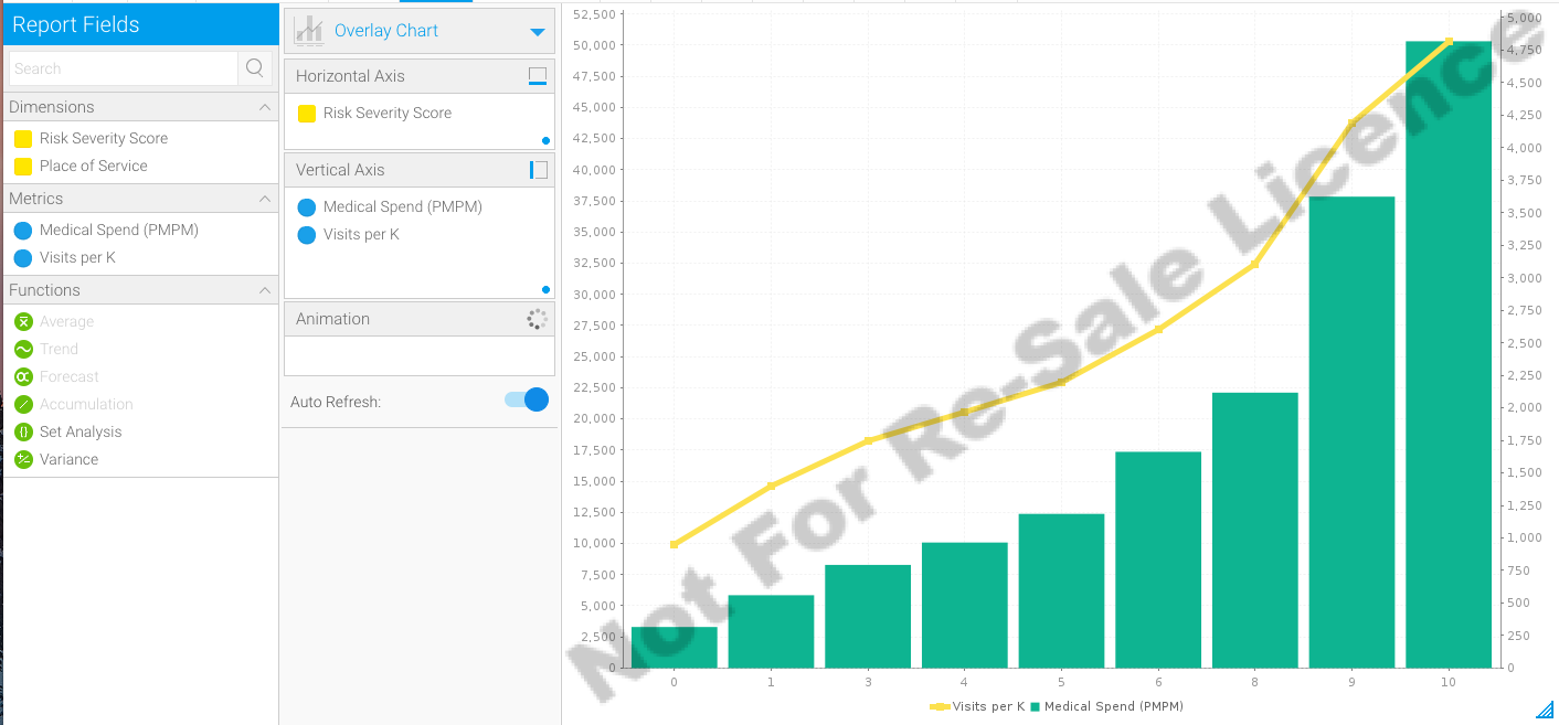
I am trying to use an overlay chart to display multiple lines of a line graph over a bar chart. I need to split one of the metrics by another dimension creating multiple lines with different colors. I am attaching a screenshot of the graph I am trying to re-create in Yellowfin as well as what I have so far in Yellowfin. I want to add the 'Place of Service' field to the Yellowfin chart to break down the 'Visits per K'.
Thanks in advance for your assistance,
Mary Hall
 The same question
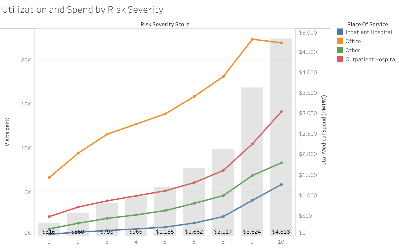
Hi Mary,
The "Set analysis" feature was specifically designed to help you with this sort of thing.
https://community.yellowfinbi.com/knowledge-base/article/7-3-set-analysis-feature_1
This allows you to basically create new calc fields at the chart level. This is new to 7.3 so if you are on an earlier version you will need to create these calculated fields manually:
Let me know if this looks like it will work.
Regards,
Nathan
Replies have been locked on this page!