
APAC SD Team


NA Business Team

EMEA SD Team
Category
Report Builder
Product Version
7.3
Allow heatgrid series selection
Completed
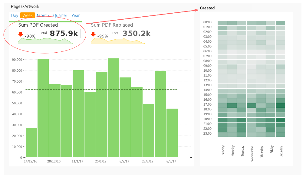
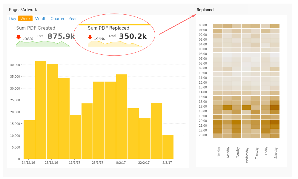
When i build bars, columns, area and line charts i can provide several dimensions and toggle between them (series).
What i would like to have is a heat grid chart that complement these dimensions, so when i toggle between the dimension, the heat grid changes dimension accordingly (see attached images).
I can link series between charts on a dashboard and have all of them change dimension, but the heat grid stays fixed on one dimension only, which is a shame because it breaks the whole dashboard behavior.
 I like this idea
Hi Yoav,
This is a good idea, all we would need to do is support series selection on heat grids.
Then once done, the dashboard would allow you to link via series select.
This enhancement has been logged and will keep you posted on any updates, though at this point in time, it has yet to be planned.
Regards,
David
Having a toggle on dimensions series selection in general, rather than just on the metrics series selection that is currently available would be great as well!
Having a toggle on dimensions series selection in general, rather than just on the metrics series selection that is currently available would be great as well!
Good day!
Are there any updates regarding this idea? My client wanted this kind of Series Selection behaviour with Heatgrid Charts.
Thanks!
Good day!
Are there any updates regarding this idea? My client wanted this kind of Series Selection behaviour with Heatgrid Charts.
Thanks!
Hi Paulo,
I hope all is well,
I have just looked at this in our latest 9 build to which I can see it is still not possible with this I would then want to propose that we have a remote session so that we can discuss some alternatives and get a better understanding of this idea raised.
Can I ask your availability/time zone? I am UK based.
Regards,
Mark
Replies have been locked on this page!