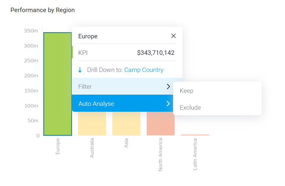
Add an option to disable keep/exclude chart filter
Completed
At the moment there doesn't appear to be a way to disable the keep/exclude filter that appears when hovering over series data on a chart:

A toggle under something like Chart Settings -> Interaction could work.

 I like this idea
Hi Niklas,
I've gone ahead and created a new Idea post for this enhancement. I hope that's okay!
In your original ticket you said you wanted it another reason in the past, if you could let me know what your use case was, that will help with making the case to the developers!
Kind regards,
Chris
Hi Niklas,
I've gone ahead and created a new Idea post for this enhancement. I hope that's okay!
In your original ticket you said you wanted it another reason in the past, if you could let me know what your use case was, that will help with making the case to the developers!
Kind regards,
Chris
Hi Chris,
the other reason why we wanted do disable the "Filter on Hover" is the legend that is shown when you hover over a chart.
Sometimes it can be quite hard to connect the color from the chart to the color of the legend below the chart. In these cases, the legend that is shown by hovering over the chart is extremely useful:
However, after about 3 seconds, the keep/exclude menu pops-up and hides this legend:
So in some cases we would much rather keep the legend instead of the option to filter.
This also happens in normal reports, not just in Dashboards.
kind regards,
Niklas
Note:
To recreate this exact behaviour it seems like you need a numerical attribute in the Horizontal Axis of the chart:
Hi Niklas,
Thanks for letting me know. I've added that to our internal notes.
I'll move this over to Idea Logged while we wait for feedback!
Yellowfin may send out a customer satisfaction survey. If you receive one and get a moment, please could you give us a rating, it really helps us out!
Kind regards,
Chris
Hi Niklas,
We have good news from the Product team regarding this case. We would like to inform you that, the enhancement has been implemented in our latest release version 9.14. You can access the release notes and downloads by visiting https://portal.yellowfinbi.com/public/releases/home.
For now, we will go ahead and mark this ticket as "Enhancement Completed", Please reach out to us if you need any additional assistance we would be happy to assist you.
Thanks & Regards,
Priya.
Replies have been locked on this page!