Scrollbar slider is initially displayed incorrectly with filters

Stefan Hall shared this problem 23 months ago
Defect Logged

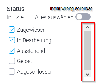
For filters with many entries, the slider is initially displayed incorrectly. It looks as if the user already sees all entries, even if it is not the case.
As soon as the user moves the slider, it becomes smaller and reflects the correct number of entries.
This misbehavior irritates users, please correct it.

c39dea2717a678aafe4f15add913d9ef

03175d9613fb64cb95233812e70f7fa9

;) Stefan

Replies (2)

photo
1

Hello Stefan,

Thanks for contacting the yellowfin support team,

While we are investigating this issue, could you please let us know the exact version and build of Yellowfin you are currently using so that we can replicate the same and get back to you with the findings.

Regards,

Chaithanya V M.

photo
1

Hi Vernu,

this is one of your standard queries. Why don't you add the SubVersion to the ticket creation menu, then no one will forget ;)

We use version 9.8.0.1

;) Stefan

photo
photo
1

Hello Stefan,

Hope your doing good!

I appreciate your thoughtful advice. About the subversion, we will plan to include the subversion in the dashboard.

Regards the Scroll bar, I have seen the same behaviour in all the Filter scroll bars in the Yellowfin, So it's not an problem it's an actual functionality in the Yellowfin, So I will go ahead and created an Enhancement request with the Dev team. If I get any updates from the Dev team I will post same here. Meanwhile I'm changing this ticket type as Idea.

Please feel free to respond here if you have any additional questions. I'm happy to help!


Regards,

Chaithanya V M.

photo
1

Hi Chaithanya,

Thanks for the information, but is a funny approach. According to your logic there are almost no more errors, only ideas.

Just because something is wrong everywhere doesn't make it an intentional design, or can YF explain why a scrollbar with wrong information for users would be a good idea? I think not. Also, I can't think of any other tools that share your approach. do you know of any software where you have to move the scrollbar to guess how many entries are actually there?

Please change the type to an error so that the misbehavior is fixed in a timely manner.

;) Stefan

photo
1

Hi Stefan,

I agree with your points, so I'm turning this ticket into a problem. feel welcome to reply here if any further related inquiries.

Regards,

Chaithanya V M.

photo
1

Hi Stefan,

I hope all is well,

Mark here from the EMEA Support Team, I know this a 12 month old ticket, however, I'm just stepping in here on behalf of Vemu as I have since tried to replicate this of which I could not.

I have tested this using;

  • macOS
  • Google Chrome/Firefox
  • 9.8.0.1 20221005 and 9.10.0.1 20231204

My results of this are as follows when viewing a report that consists of x amount of filters with the scrollbar visible;

74da4ddb32066bad8295682db76c09eb

f73034cfe9c0488401dc9e7342d5c9bc

You can also see my video attached showing this.

What next?

I want to further explore this as I suspect this might be Browser/Machine specific. Can you help me out here and inform me of these? I would love to get this resolved for you :-)

Regards,

Mark

Files: A.mov
photo
1

Hi Stefan,

In addition to this I see that you used Checkboxes, I had used List of which it works as expected for List, however upon checking this with Checkboxes I also get similar results. albeit the scrollbar reacts different to yours as it disappears.

What next?

If we can still get the info requested from my previous response that would be great, I can forward this on to our development team, however, we can clearly see there is something not quite right, you can see my video of this attached.

Apologies for not getting this resolved, however additional feedback would be great going forward.

Regards,

Mark

Files: A 2.mov
photo
1

Hi Mark,


everything is great with me, it's nice that we can solve something together ;)

I've tested it again here, as there have been a few updates in the meantime. I use


  • Win 10 22H2
  • FF 115.6
  • Edge 120

There is no change in either browser. The scrollbar initially still fills the entire area and suggests to users that all entries are displayed. Very irritating.

;) Stefan

photo
1

Hi Stefan,

Thank you for the feedback, this will help a lot. I will make sure this is forwarded to the Defect Logged ticket that we have with our Developers. Whilst I do this, I will also reach out to the wider team to see if we can further test at our end as I unfortunately don't have a Windows based machine.

I will work on this today and update you where I can.

Regards,

Mark

photo
1

Hi Stefan,

I hope all is well and huge apologies for the delay with getting a response. I have since tested this on a Windows (Windows 11) based machine using 3 different Browsers. Please see my results below;

Google Chrome - 120.0.6099.217 (64-bit)
Notice the scrollbar arrow pointing down is darker than the one pointing up, this is indicating that theres more information to navigate through when scrolling.

1387eedf297ff56d6ec9e5d38b70085c

a4487ae2a3db03b453f2f37ae01a6c3c

Microsoft Edge - 120.0.2210.133 64-bit
d1b5279f33eae3d1f4e6454ee65a3aaa

4bc59aa5f473303cd55cb74928150d29

Firefox - 121.0.1 64-bit
I got different results for these, albeit the scrollbar still performed the way you described. See video link below.

https://ftp.yellowfin.bi/f/03fa86007f28a038

What next?

As we already had this logged as a Defect, I felt the need to step in and further assist of which by doing so I can now give this additional information to our Developers to help further progress.

I hope this is ok Stefan, and have a great weekend

Regards,

Mark

photo
1

Hi Mark,


a defect sounds good for me ;) The slightly darker little arrow is a small indication, but certainly not a general replacement for a "good" slider.

Thanks for your support and let's see what your developers come up with for a solution.

Have a nice Weekend!


;) Stefan

photo
Leave a Comment
 
Attach a file