Null behavior as zero not working on line chart
Answered
I'm trying to take advantage of the null as zero option, but it's not working for me. This red segment is the problem:
Here is the underlying data, filtering only for records in that red series:
And indeed the chart has the right data points, y = 2 for the interval 2018-07-10 to 2018-07-12 and then y = 6 for the date 2019-04-02, which is not grouped together with other dates. But it should not be drawing a line between them.
I have all three fields used in the chart set to Null Behavior = Zero, like this:
Can you advise on what else I might try to get rid of this connected line, which should be zero for the many dates between its 2 and 6 values?

 The same question
Hi Sam,
Apologies for the delay.
We have an option in the chart settings to Fill the gaps for each granularity period based on the Null Behavior selected(zero in our case). Please refer to the attached screenshot.
Kindly let me know if that helps.
Best Regards,
Deepak
Hi Sam,
Apologies for the delay.
We have an option in the chart settings to Fill the gaps for each granularity period based on the Null Behavior selected(zero in our case). Please refer to the attached screenshot.
Kindly let me know if that helps.
Best Regards,
Deepak
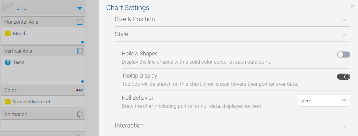
Thank you for the reply. I went to chart settings and my screen doesn't look quite like yours. Null Behavior is set to Zero already and it still doesn't work. I don't have that toggle for "Fill In Granularity Gaps for Series".
Here's what I see:
Can you please advise further?
Thanks,
Sam
Thank you for the reply. I went to chart settings and my screen doesn't look quite like yours. Null Behavior is set to Zero already and it still doesn't work. I don't have that toggle for "Fill In Granularity Gaps for Series".
Here's what I see:
Can you please advise further?
Thanks,
Sam
Hi Sam,
Thanks for reaching out.
I believe its because the 'month' field in the new chart seems to a dimension unlike the 'complaint_date' which is a date field in the previous chart. Please try changing the month into date format and let me know how that goes.
Best Regards,
Deepak
Hi Sam,
Thanks for reaching out.
I believe its because the 'month' field in the new chart seems to a dimension unlike the 'complaint_date' which is a date field in the previous chart. Please try changing the month into date format and let me know how that goes.
Best Regards,
Deepak
Ah sorry to change the example on you there, I have multiple tickets open and got confused. Yes, your proposed fix accomplished the desired charting behavior. Thank you! Unfortunately, it came with a terrible hit to performance; now the chart freezes up the browser for a minute or so.
There are 16 series values of "CustFieldName" the user can choose and the timespan is 5 years. Most series don't have events most days, so it's currently just 1,480 data points. I calculate that if I ask Yellowfin to impute a zero for each day & series combination, that would be 29k data points. Seems like that could cause a minor slowdown but instead it's so bad as to render the report unusable.
We have separate tickets open about the performance of our instance, so I think we can close this one now that you've explained how I should set the chart up. Unless you have ideas for how I could tune something to fix this. The "Date" column is a Date-format column with granularity "Day".
If we investigate performance further, I might try imputing the zeroes myself in the data source and seeing if that results in better performance than having Yellowfin do it on the fly.
Thanks,
Sam
Hi Sam,
Thanks for confirming that the desired charting behavior is achieved - "Null To Zero".
Yes, you are correct, this would definitely add extra data points. Unfortunately, I couldn't think of any other way around for reducing the data points in our case (with date granularity - 'day' and 'Fill in Granularity Gaps for Series' turned on).
As we have 5 years of data for analysis, I think:
1. We can change the chart granularity to 'month'/'Quarter'/Year which would aggregate the values in 'Tests' column.
2. Or if we only want analysis with 'day' granularity then, set a default filter value for date (for about a year), and then we can filter for other years from the 'User prompt'. This way we have less data points for YF to display at one point of time and would be easier for analysis
And I believe inputting zeroes in the data source would also help in our case as YF would then just have to display the values(no computation involved)
Regards,
Deepak
Replies have been locked on this page!