Makeover Monday - Week 21 - Premier League 2017-18 Review
Overview
Our consulting teams across the regions are participating in a popular social data project called Makeover Monday. The way this project works: a new data set is released every week - usually accompanied by a chart - and participants have the chance to improve the chart/story, tell a new one, or simply create an awesome dataviz with Yellowfin.
If you have any questions around the submissions e.g about data preparation, data viz creation, to canvas design - please feel free to comment below. If we get enough common questions around a submission, we might even spin up a blog or video to help!
Week 21
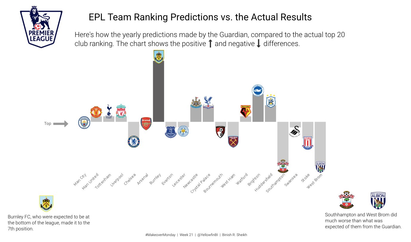
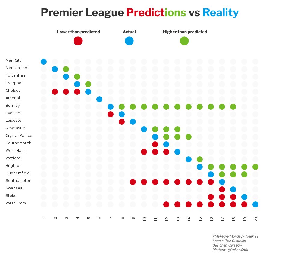
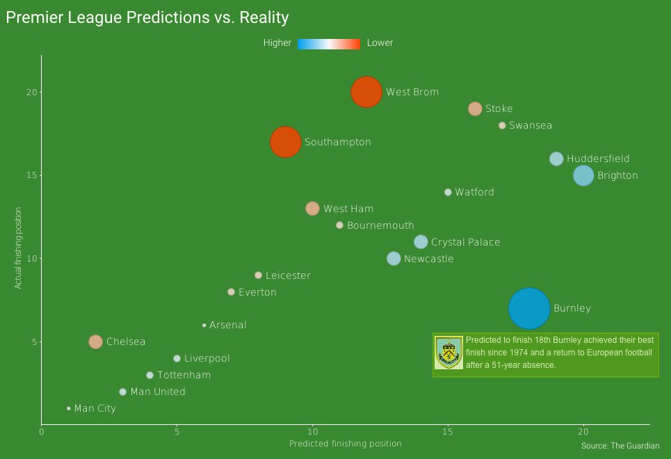
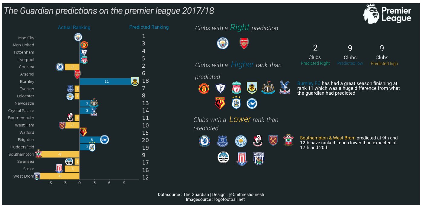
This week's submission is on a dataset that shows the English Premier League 2017-18 predictions made by The Guardian vs what actually happened. For this week, we have 4 submissions:

Interactive version: https://discover.yellowfinbi.com/RunReport.i4?reportUUID=1918cdd4-a6e2-4235-b3b7-3bf7371bbad8&primaryOrg=1&clientOrg=1

Interactive version: https://discover.yellowfinbi.com/RunReport.i4?reportUUID=d6f7f913-722b-40c4-8f5c-d7b0e0748eb0&primaryOrg=1&clientOrg=1

Interactive version: https://discover.yellowfin.bi/RunReport.i4?reportUUID=fd11d075-c70a-43c6-a6fc-59a0465299ed&primaryOrg=1&clientOrg=1

Interactive version: https://discover.yellowfinbi.com/RunReport.i4?reportUUID=2daf340b-0499-47a0-91bf-da3e5904fa0b&primaryOrg=1&clientOrg=1

 The same question
Interesting stuff!!
I would like to know How the Images/logos are placed as labels on the bar chart.
Regards,
Syed
Interesting stuff!!
I would like to know How the Images/logos are placed as labels on the bar chart.
Regards,
Syed
Replies have been locked on this page!