
Yellowfin Support Team
Category
Chart Builder
Product Version
7.1
How to make Stacked Vertical column chart?
Answered
Hi,
I'm trying to make a stacked vertical column chart for the first time, to compare two totals of the data, I've chosen stacked vertical column chart but the vertical field only allow one single measures/data. Can anyone help advise me?
Files:
Untitled.jpg
 The same question
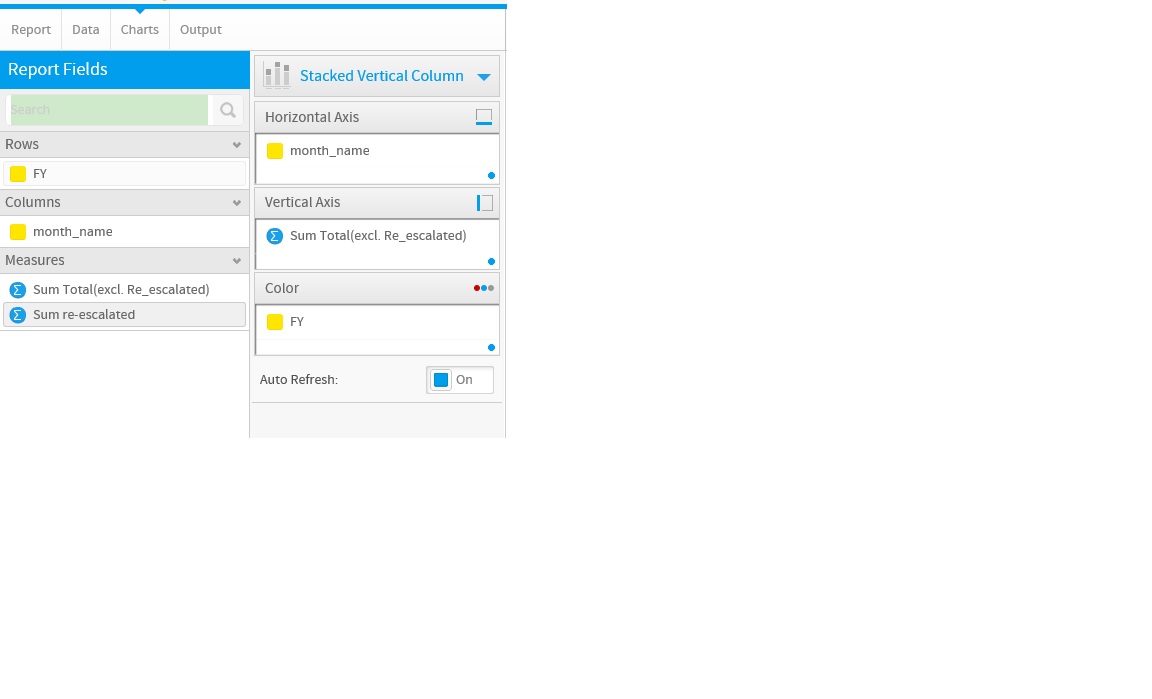
Hello Steven,
Thank you for reaching out to us.
When using a stacked vertical column you are limited to one measurement on the vertical axis, this is then stacked or grouped by the color selection.
Based upon the screenshot provided a vertical column chart would allow you to set the Year on your horizontal, month for the color and both values can be graphed.
I hope this helps, please let me know if you have any further questions.
Kind regards,
Nathan Goddard
Replies have been locked on this page!