
Category
Chart Builder
Product Version
8.0
Creating a ring chart similar to summary report
Idea Logged
I would like to create a ring chart similar to one found in the report summary where I can choose how many metrics to be displayed and the rest is shown as others. The summary is okay, but not great for all type of dashboard view, beside yf does not allow to only create a dimension split without a metric first - which is not what I want.
I want to display like this:
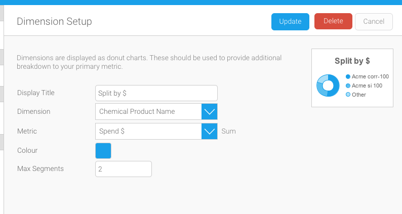
Using a ring chart
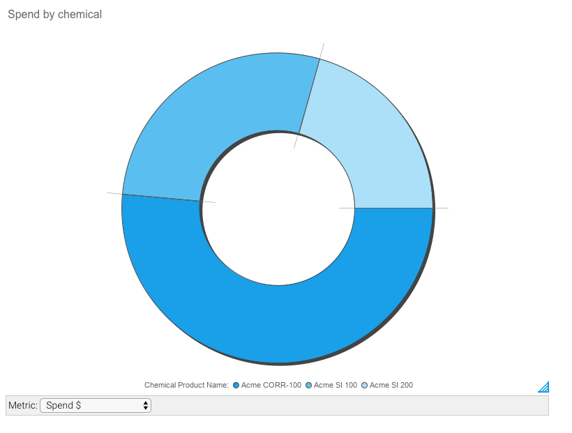
This seem to be difficult to achieve in the reports. I´ve tried using top N which only shows top N and not the rest. I tried using a total columns and CASE to show others instead of the dimension name but calculated field only works on views dimension and not formatted columns!
Any ideas?
Thanks in Advance!
 I like this idea
Replies have been locked on this page!