
Category
Report Builder
Product Version
7.3
Displaying currently applied filters in a dashboard
Answered
When using Drill Down on a chart in a dashboard, how can a user see the currently active filters applied to all the charts inside the dashboard?
Specifically, is there a way to show the filters at the dashboard level in the same way as chart level (see attached file)?
Files:
Screen Shot 201...
 The same question
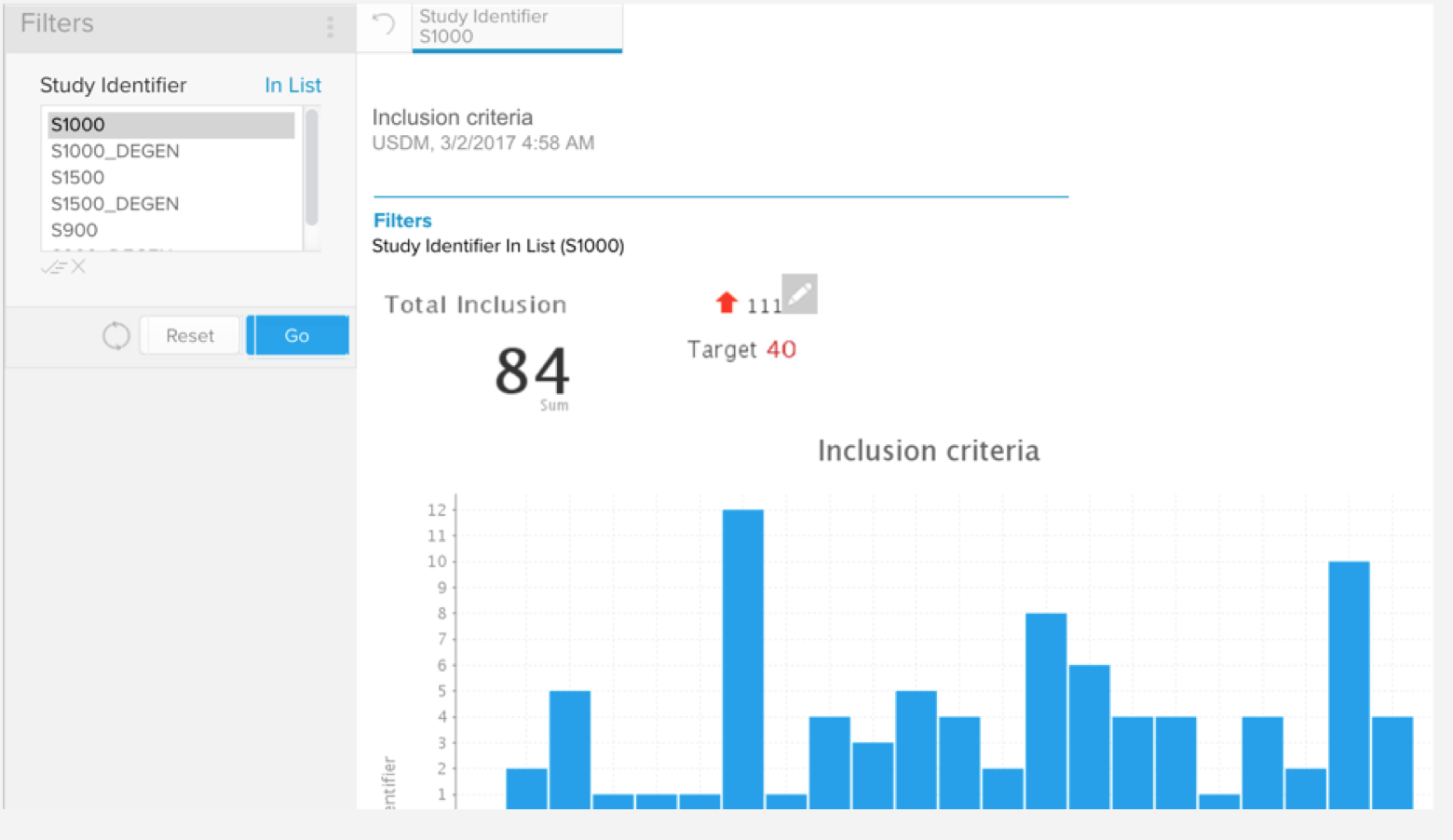
Hi Joseph,
The mechanism we have in place to display these filters is slightly different on a dashboard than on the report itself, but achieves a similar outcome. This can be found in the report's drop-down menu as seen below:
Please let me know if this works for you.
Regards,
Nathan
Hi Joseph,
The mechanism we have in place to display these filters is slightly different on a dashboard than on the report itself, but achieves a similar outcome. This can be found in the report's drop-down menu as seen below:
Please let me know if this works for you.
Regards,
Nathan
Thanks for the reply Nathan.
We are building out-of-the-box dashboards and reports with out-of-the-box "data analysis and investigation flows" (configured in the form of drill throughs/downs). As part of this, we want to be able to display the "context" to a user, e.g. when a user drills down or through, displaying the applied filters based on their selection in the prior dashboard or report.
Hence, the question: can the filters always be shown by default or would the user always need to do apply the "show filters" manually?
Additionally, the problem I see is that in this feature, each report is showing the filter. However, because it would be the same filter applied to all the reports in the dashboard (for instance, the reports are all filtered to only show the data for a specific country), it would seem highly repetitive to display the same applied filter for each report individually. Can the applied filter be displayed at the dashboard level and not for each report?
Hi Joseph,
Unfortunately this setting will need to be enabled manually by the user each time they view the dashboard, and is specific to each report.
I am not sure if this is relevant to your needs, but it might be worth looking into creating "header" reports that contain one of the columns being filtered on, so when you apply a filter you will see a row for each of the values remaining after the fitler.
There are ways to do this within a single report, but these are all odd workarounds that may not be aesthetically pleasing or worth the effort. Javascript charting will make all of this far easier!
Sorry for the inconvinince.
Regards,
Nathan
Yes please... We are after something like this too
Yes please... We are after something like this too
Hi Joseph,
I am going to close this case for now, but if there is anything else I can do, just reply and the case will be re-opened!
Regards,
Nathan
Hi Joseph,
I am going to close this case for now, but if there is anything else I can do, just reply and the case will be re-opened!
Regards,
Nathan
Replies have been locked on this page!