
Category
Report Builder
Product Version
7.3
Ability to use dimensions for colour in stacked column charts
Answered
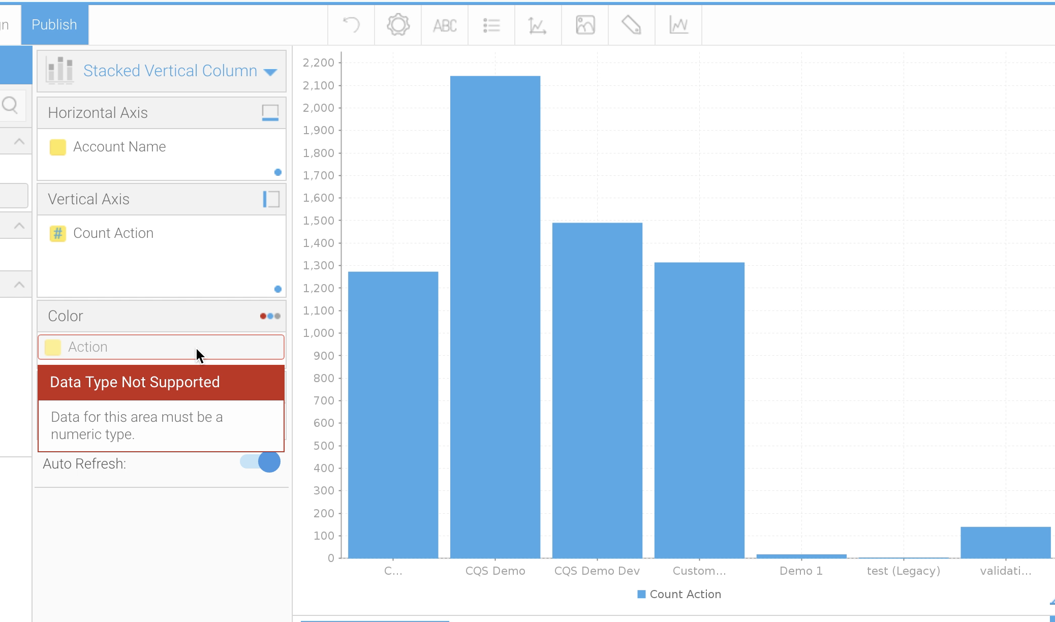
Stacked column charts expect a metric value for the "Colour" field. It would be very useful to have the ability to use dimensions here. There is a discrepancy in behavior since this is possible when using an "Auto Chart", but not when using a Stacked Vertical Column chart directly. For example, see attached AutoChart.png and StackedVertChart.png. The auto chart version is missing some formatting options and axis settings, so it is not fully functional.
It is possible to create a stacked vertical chart if the source table is a crosstab report, but that is very limiting. We do not want to always create a crosstab in order to have a stacked column/bar chart.
 The same question
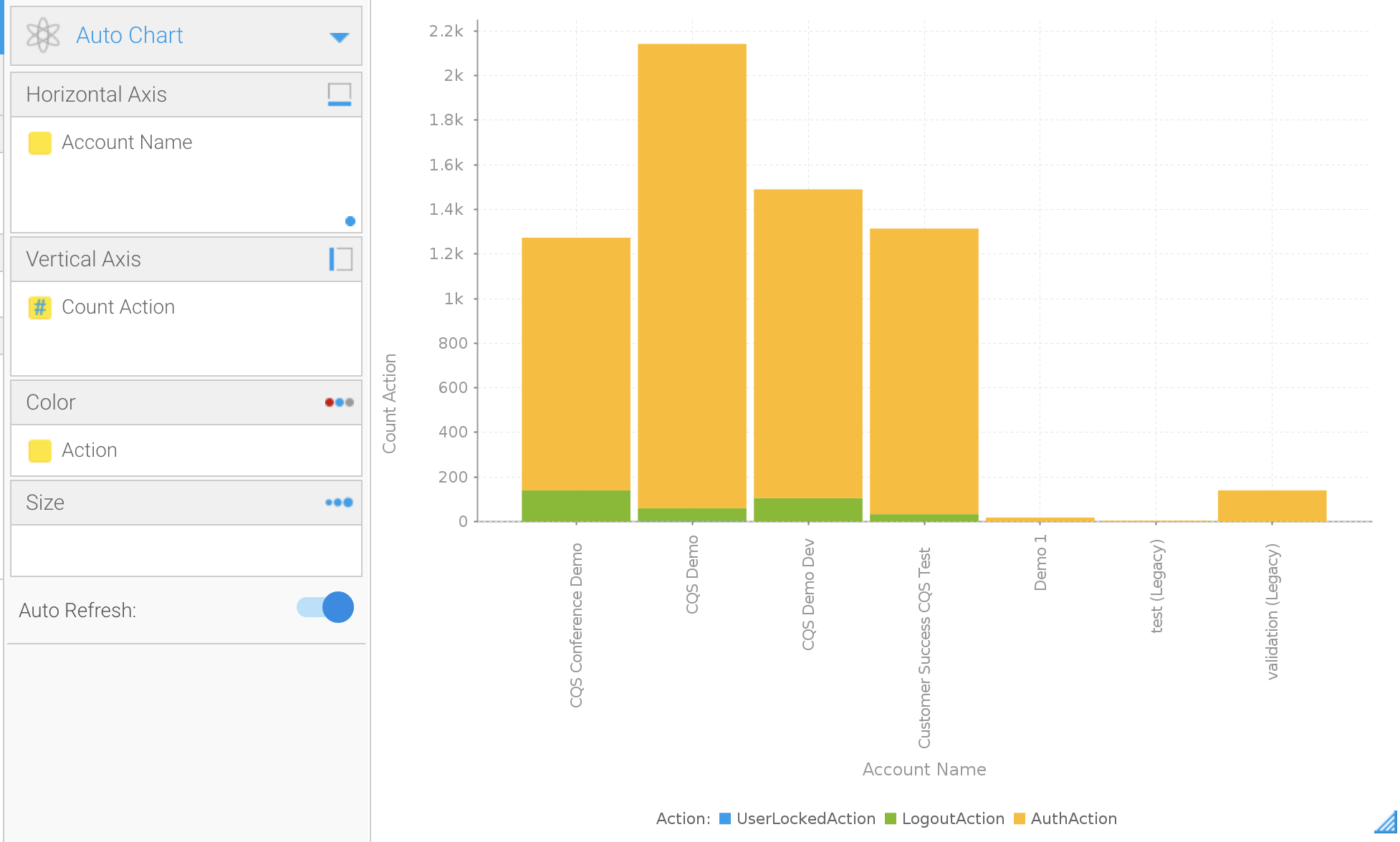
Hi Jonathan,
Thanks for the detailed info.
I think what you're after is already possible with a Trellis chart.. secretly this is what 'Auto Charts' are usually based off.
See screens below as example:
Hope this covers what you're after, and if not, please let me know.
Thanks,
David
Hi Jonathan,
Thanks for the detailed info.
I think what you're after is already possible with a Trellis chart.. secretly this is what 'Auto Charts' are usually based off.
See screens below as example:
Hope this covers what you're after, and if not, please let me know.
Thanks,
David
Thanks David - yep that was what I was looking for! Didn't realize it was a Trellis chart that Auto Chart was making.
Thanks David - yep that was what I was looking for! Didn't realize it was a Trellis chart that Auto Chart was making.
Replies have been locked on this page!