
Category
Chart Builder
Product Version
9.0
How: Line chart with Top10 lines (from 100)?
Answered
Hello YF-Community,
we would to generate
- a line chart
- with the Top10 (or Top5) customer revenues from the last 12 months per month
- wehere the Top10 customers should be the ones which had the 10 highest revenues last month.
Have a look at the attached graphic we we modeled how it should look like.
The difficulty for us: The Top10 customers should be the customers with the highest revenues in the last month. So the Top10 (which should be displayed as a line chart) could change every month. We were not succesful in modelling it in Yellowfin. We tried to apply calculated filters, subqueries or top10-rankings. But: We didn't succed. so, question to the community: Do you have an idea?
Thanks in advance!
Florian
Files:
top10 line char...
 The same question
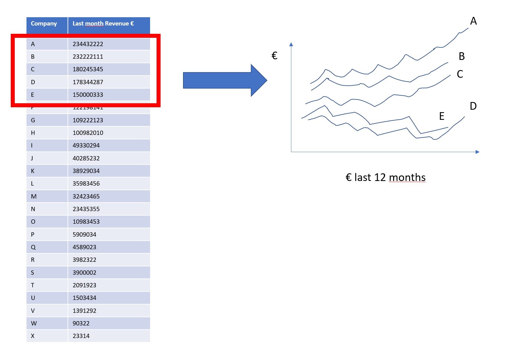
Hi Florian,
Thanks for reaching out. This type of content creation assistance is usually handled by our consulting department - do you know if you have and Extended Services time available with us?
You can use the Trim function on categories and apply a metric field to it, is this what you're looking for?
You could possibly achieve this with freehand SQL as well.
Hope this helps! Let me know if you have any additional questions.
Thanks,
Eric
Hi Florian,
I'm going to go ahead and mark this Question as Answered at this time. Feel welcome to reach out in the future.
Thanks,
Eric
Hi Florian,
I'm going to go ahead and mark this Question as Answered at this time. Feel welcome to reach out in the future.
Thanks,
Eric
Hi Eric,
I am not sure if my previous reply was sent correctly?
In short again: Where can I find the mentioned trim-function for line-charts?
In my Yellowfin there's no "trim" in the line-chart series settings (only in bar charts).
Thanks in advance
Florian
Hi Eric,
I am not sure if my previous reply was sent correctly?
In short again: Where can I find the mentioned trim-function for line-charts?
In my Yellowfin there's no "trim" in the line-chart series settings (only in bar charts).
Thanks in advance
Florian
Hi Florian,
I can make a request to developers to look into implementing this functionality in a future version of the application if you'd like, just let me know.
Thanks,
Eric
Hi Florian,
I can make a request to developers to look into implementing this functionality in a future version of the application if you'd like, just let me know.
Thanks,
Eric
> I can make a request to developers to look into implementing this functionality in a future version of the application if you'd like, just let me know.
Hi Eric,
yes, please, that would be awesome!!!
Best
Florian
> I can make a request to developers to look into implementing this functionality in a future version of the application if you'd like, just let me know.
Hi Eric,
yes, please, that would be awesome!!!
Best
Florian
HI FLorian,
I was checking out dev platform and see this -
So this might be a limitation of time series charts, can you try an A/B test to see if you have this option in some circumstances?
Thanks,
Eric
HI FLorian,
I was checking out dev platform and see this -
So this might be a limitation of time series charts, can you try an A/B test to see if you have this option in some circumstances?
Thanks,
Eric
HI Florian,
This type of content creation assistance is out of scope for support; feel welcome to contact an account manager for consulting opportunities on this.
Thanks,
Eric
HI Florian,
This type of content creation assistance is out of scope for support; feel welcome to contact an account manager for consulting opportunities on this.
Thanks,
Eric
Replies have been locked on this page!